
Wainscoting has a reputation problem. Say the word and most people picture stiff, colonial-style paneling that belongs in a formal dining room, not a house on Cape Cod. That’s outdated thinking. Modern wainscoting ideas have moved past the fussy trim work of decades past into cleaner lines, bolder proportions, and finishes that fit contemporary coastal homes just as well as they fit a city loft.
If you’re trying to figure out how to bring texture and character to a flat wall without making the room feel dated, this is where to start. We’ll walk through fresh panel styles, unexpected paint pairings, and height and material choices that read as current rather than traditional, so you can pick a look that actually matches your home instead of forcing a style that doesn’t belong.
Below are eight approaches we’ve seen work well in real homes, from entryways to primary bathrooms. Each one covers practical styling details you can use right away, plus a few notes on where each style tends to shine. As a shop that hand-builds custom millwork here in Hyannis, we’ve installed enough wainscoting to know which trends hold up and which ones fade fast, so consider this your shortcut to smart choices.”
1. Flat-panel wainscoting for a clean, minimalist look
What it looks like
Flat-panel wainscoting swaps out the raised, beveled panels of traditional wainscoting for simple, recessed or applied rectangles set flush against the wall. There’s no ornate molding, no fussy detailing, just clean geometry and shadow lines created by the panel edges. It’s the style most closely tied to modern wainscoting ideas because it strips paneling down to its structural bones, letting proportion and spacing do the work instead of decoration.
Flat-panel wainscoting works because it lets the room breathe instead of competing for attention.
Best rooms for this style
This style suits almost any room, which is part of why it’s become the default choice for homeowners updating a space without committing to a heavy design statement. It looks especially sharp in home offices, entryways, and dining rooms where you want a tailored backdrop without visual noise. In smaller rooms, the simplicity keeps walls from feeling busy or closed in, something worth considering if you’re working with a tight hallway or a compact powder room.
Color and material ideas
Flat-panel wainscoting reads as most contemporary when it’s painted a single color, wall and panel alike, in a soft white, warm greige, or muted sage. Skip the classic white-on-white with glossy trim contrast if you want the look to feel current rather than nostalgic. For a custom cabinetry feel that ties the wainscoting into the rest of the room’s woodwork, we often build panels from the same poplar or MDF used in built-ins through our interior carpentry work, then finish everything in one cohesive paint color. Matte and eggshell finishes hold up better against fingerprints than semi-gloss and photograph less like plastic.
Installation considerations
Because flat panels rely on precise, even spacing rather than ornamentation, layout matters more here than with almost any other style. Get the reveals wrong and the whole wall looks off, even if you can’t say exactly why. A few things worth planning for:
- Panel width should divide evenly across the wall, avoiding awkward slivers at corners or doorways
- Standard wainscoting height runs 32 to 36 inches, but flat-panel styles often look best pushed to chair-rail height or higher for a modern proportion
- MDF holds paint cleanly and resists warping better than solid wood in humid coastal bathrooms
- Outlets and switches need to be mapped before panels go up, not worked around after
Because the margin for error is so small, this is a style where hand-built, on-site measuring pays off over pre-fabricated kits, so it helps to know what wainscoting installation costs before you commit.
2. Extra-tall board and batten for a modern statement
What it looks like
Board and batten trades panels for vertical strips, or battens, spaced evenly over a flat board or the wall itself, creating a rhythm of raised lines from baseboard to a set height, which is the main difference between wainscoting and board and batten. The modern twist is scale. Instead of stopping at the traditional 32 inches, extra-tall board and batten climbs to 60 inches, sometimes higher, turning a trim detail into a full architectural statement. Wider spacing between battens and thinner, more streamlined boards keep the look from feeling heavy or overly rustic.
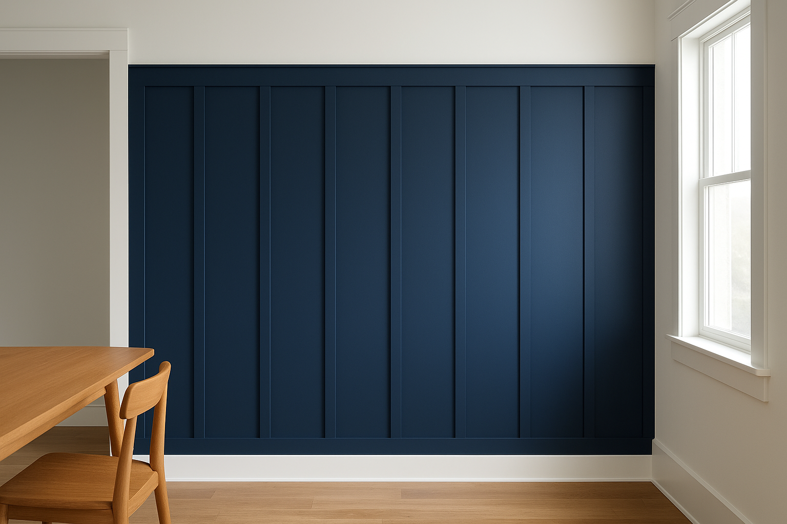
Pushing board and batten taller than tradition dictates is what separates a modern statement wall from a farmhouse cliché.
Best rooms for this style
This style earns its keep in rooms with high ceilings, like entryways, staircase paneling, and primary bedrooms, where the extra height gives the eye somewhere to travel. It also works well as a single accent wall behind a bed or dining table, rather than wrapping an entire room, which can start to feel like overkill in smaller spaces.
Color and material ideas
A single matte color from wall to batten reads as the most current approach, especially in deep charcoal, navy, or warm white. Poplar or primed MDF battens paint up cleanly and won’t telegraph seams once finished.
Installation considerations
Extra height means extra attention to wall studs for anchoring, plus careful planning around window and door casings so the battens land in proportion rather than crowding trim.
3. Vertical shiplap for subtle texture
What it looks like
Vertical shiplap turns the classic horizontal farmhouse board on its side, running narrow, overlapping planks from floor to a set height instead of across the wall. The subtle texture comes from the small shadow gaps between boards, which catch light differently depending on the time of day. Unlike flat-panel styles, shiplap keeps a bit of grain and grooves visible even under paint, giving the wall a quiet, tactile quality without looking rustic or dated.
Turning shiplap vertical is the single change that moves it from farmhouse cliché to modern wall treatment.
Best rooms for this style
Bathrooms and mudrooms benefit most from vertical shiplap because the linear pattern draws the eye upward, making low-ceiling rooms feel taller, one of several bathroom paneling options built for moisture. It also pairs well in hallways and beside laundry room cabinets where you want texture without a heavy visual statement, and it holds up better than horizontal runs in narrow spaces since it doesn’t widen the wall the way horizontal lines do.
Color and material ideas
White and soft neutral tones keep the texture visible without shouting for attention, while a monochrome wall-to-shiplap paint job feels more current than painted boards against a contrasting wall. Cedar or primed pine boards milled thin work well for this look, and we typically build these as custom cabinetry-adjacent millwork so the panel spacing matches nearby built-ins.
Installation considerations
Gaps between vertical boards need consistent spacing to avoid a crooked appearance, and boards should be sealed properly in bathrooms to prevent moisture from warping the wood over time.
4. Dark and moody wainscoting in black or navy
What it looks like
Dark and moody wainscoting takes any panel style, flat-panel, board and batten, or shiplap, and finishes it in a deep black, charcoal, or navy instead of the usual white or greige. The panel profile stays understated, letting the color itself do the heavy lifting. Against a lighter ceiling and trim, the contrast reads as intentional and tailored rather than heavy-handed, which is what separates this from the dark accent walls of a decade ago.
Dark wainscoting doesn’t shrink a room, it gives the walls a weight and confidence that pale colors can’t match.
Best rooms for this style
Home offices, dining rooms, and powder rooms handle dark wainscoting especially well, since these tend to be spaces you occupy briefly and want to feel dramatic rather than restful. It also works in primary bedrooms when paired with warm lighting, though we’d steer clear of small rooms with limited natural light unless you’re deliberately going for a cocoon-like feel.
Color and material ideas
Matte black, deep navy, and near-black charcoal are the three colors we install most often, the same palette behind the best modern dark cabinetry, and each looks sharper with brushed brass or matte black hardware nearby. Poplar and MDF panels both take dark paint evenly, though poplar resists chipping better around doorframes and high-traffic corners.
Installation considerations
Dark colors expose every imperfection in a wall, so surfaces need to be sanded and primed more carefully than they would for a lighter finish. Plan lighting adjustments too, since dark wainscoting absorbs more light than it reflects.
5. Two-tone wainscoting with contrasting trim
What it looks like
Two-tone wainscoting splits the wall into two distinct color zones, usually with the panel or batten portion in one shade and the wall above in another, tied together by a contrasting trim line where the two meet. Instead of the classic white wainscoting under a colored wall, modern versions flip expectations, pairing a deeper panel color with a lighter wall above, or running two saturated tones together for a bolder split. The trim cap itself often becomes a small design detail, painted in a third accent color or left in a natural wood tone to separate the zones cleanly.
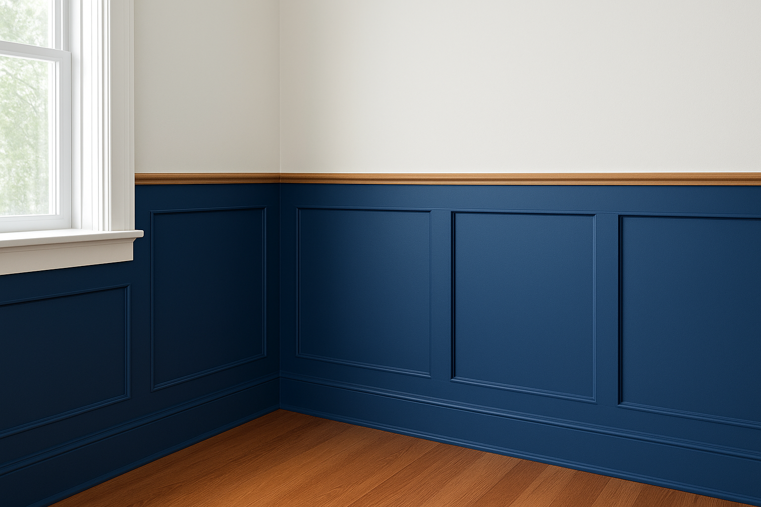
Two-tone wainscoting works because the color break gives a plain wall structure it didn’t have before.
Best rooms for this style
Dining rooms and primary bedrooms suit two-tone paneling especially well, since the horizontal color break adds formality without needing extra molding detail. It also reads nicely in stairwells, where the eye naturally travels along the color line as it climbs.
Color and material ideas
Pairing a warm terracotta or forest green panel with a soft white wall feels current, as does navy under a pale blue upper wall. We build these from primed poplar panels, which take saturated colors evenly without the grain telegraphing through, unlike some lower-grade MDF.
Installation considerations
Getting the color line level around the entire room matters more here than with single-tone styles, since any dip or rise is immediately visible where the two colors meet.
6. Wainscoting paired with bold wallpaper
What it looks like
Bold wallpaper above a wainscoting panel is one of the fastest ways to modernize a wall that would otherwise read as plain millwork. The panel section stays simple, usually flat-panel or a low board and batten, while the wall above carries a large-scale print, a graphic botanical, or a saturated color pattern that would feel overwhelming floor to ceiling. Wallpaper wainscoting gives you the texture of custom carpentry without turning the whole room into a design statement.
The panel grounds the room while the wallpaper gives it personality, and neither one has to fight for attention.
Best rooms for this style
Powder rooms and entryways handle this combination best, since both are spaces you pass through rather than live in for hours, which makes a bold pattern feel exciting instead of exhausting. Dining rooms work too, especially when the wallpaper picks up a color already present in the room’s furniture or artwork.
Color and material ideas
Stick to a neutral panel, white, warm greige, or soft black, so the wallpaper carries the color story. Grasscloth, botanical prints, and geometric patterns in deep jewel tones pair especially well with flat-panel wainscoting underneath.
Installation considerations
Measure the panel height before ordering wallpaper, since seams should land cleanly at the trim line rather than mid-pattern. Hiring a professional installer for the paper avoids bubbling and mismatched seams around outlets and corners.
7. Geometric grid-pattern wainscoting
What it looks like
Geometric grid-pattern wainscoting breaks the wall into a series of squares or rectangles using thin strips of trim, creating a grid layout instead of the single vertical or horizontal rhythm you get with board and batten or shiplap. Some grids stay perfectly even, while others mix square and rectangular cells for a more architectural feel. The effect reads as sculptural rather than decorative, which is why it’s become a favorite among modern wainscoting ideas for homeowners who want something that looks custom-designed rather than pulled from a catalog.
A well-proportioned grid turns a flat wall into a piece of architecture without adding a single extra object to the room.
Best rooms for this style
Home offices, primary bedrooms, and formal living rooms suit this style best, since the grid pattern needs a bit of visual breathing room to register properly. Avoid cramming it into narrow hallways where the repeating lines can feel busy rather than intentional.
Color and material ideas
A single matte paint color across the whole wall, grid and background alike, keeps the geometry looking current instead of like leftover 1990s trim work. Poplar strips mitered at clean 90-degree angles hold their shape better over time than MDF trim pieces, especially in rooms with fluctuating humidity.
Installation considerations
Grid spacing has to be measured and squared with real precision, since even a slightly off angle throws the whole pattern out of balance. This is one style where working with a shop that builds and installs custom cabinetry pays off, since layout errors are expensive to fix after the fact, and it helps to understand how custom millwork is designed and built before you start.
8. Mixed-material wainscoting with wood and tile
What it looks like
Mixed-material wainscoting combines a wood panel base with a tile insert, stone accent, or metal trim strip, breaking up the wall with texture instead of relying on paint alone. Wood and tile wainscoting often pairs a painted or stained lower panel with a band of subway tile, marble, or textured stone set into the design, creating depth you can’t get from a single material. This approach shows up most in transitional bathroom design where homeowners want the durability of tile without losing the warmth of trim.
Mixing wood and tile gives a wall two textures to work with instead of one, which is what makes it feel custom rather than catalog-bought.
Best rooms for this style
Bathrooms and mudrooms make the most sense for this style, since tile handles moisture and daily wear better than painted wood alone, which is why it shows up so often in coastal bathroom renovations. Kitchens work too, especially near a wet bar or coffee station where a tile band protects the lower wall from splashes.
Color and material ideas
Matte black or brushed brass trim strips separate the materials cleanly, while a neutral tile in cream or soft gray keeps the combination from feeling busy. We build the wood portion from primed poplar, which holds paint evenly against the harder edge of tile.
Installation considerations
Tile and wood expand differently with humidity, so the transition point needs a flexible caulk joint rather than a rigid seam. Sequencing matters here too, since tile setters and carpenters need to coordinate so the reveal lines up perfectly on both sides.
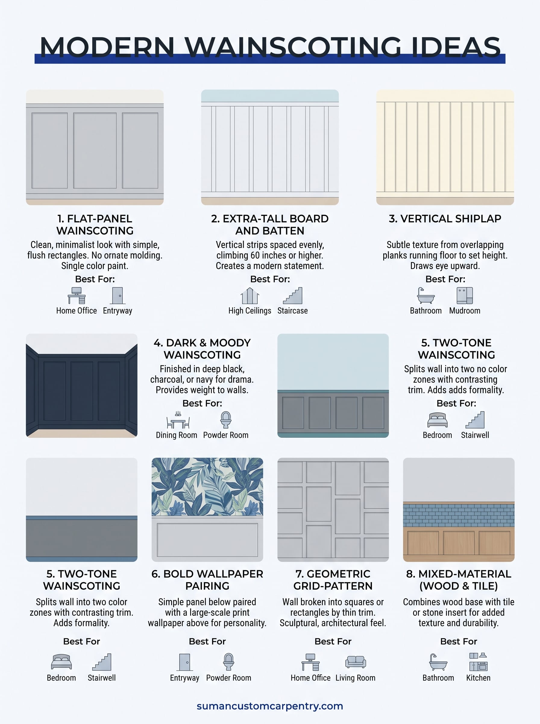
Choosing the right style for your home
None of these eight styles is objectively the best choice, they’re just tools that fit different rooms and different tastes. A small powder room can handle a bold wallpaper pairing that would overwhelm a great room, while a coastal primary bedroom might call for the quiet texture of vertical shiplap instead of a dramatic dark finish. Matching the style to the room matters more than chasing whatever look is trending this year.
Quality installation matters just as much as the design you pick. Even the cleanest flat-panel layout looks off if the reveals are uneven or the paint job is rushed, and that’s where working with people who build custom millwork by hand, rather than installing pre-fab kits, makes the difference between a wall that looks staged and one that looks like it belongs in your home.
If you’re ready to turn one of these ideas into something built specifically for your space, talk to our team about custom carpentry on Cape Cod and what your project would take.