
Floating shelves look simple until you actually try to fill them. Most people end up with a lopsided mess of books, a plant that’s dying, and one candle nobody asked for. If you’ve stood in front of your living room wall wondering how to style floating shelves so they look intentional instead of accidental, you’re not alone, and the fix has less to do with buying more decor and more to do with how you arrange what you already own.
Good shelf styling comes down to a few repeatable principles: varying height and texture, grouping items in odd numbers, and leaving enough negative space so the wall can breathe. Designers lean on these rules constantly, and once you see them, you can’t unsee a badly styled shelf.
We build a lot of custom shelving and built-ins here on Cape Cod, so we’ve watched plenty of beautiful shelves get filled with clutter after installation. This guide walks through practical arranging tips, layout formulas, and real styling examples so your floating shelves finally look like they belong in a design magazine, not a garage sale.
What makes a floating shelf display look designer-made
Designers rarely think about shelves as storage. They think about them as small compositions, more like arranging a still life than filling a cabinet. Every object earns its spot based on shape, height, and how it plays off its neighbors. That mental shift is the real difference between a shelf that looks curated and one that looks like you emptied a drawer onto a board. Once you start treating your shelf as a tiny scene instead of a shelf, the styling choices get a lot easier to make, especially if you borrow from floating shelves decorating ideas built for every room.
The rule of three (and why odd numbers work)
Group objects in odd numbers, usually three or five per cluster. Odd-numbered groupings feel more dynamic to the eye than pairs, which tend to look static and matched. A three-piece grouping might be a stack of books, a small vase, and a single piece of art leaning against the wall. Vary the heights within the group so your eye travels up and down instead of scanning flat across a row.
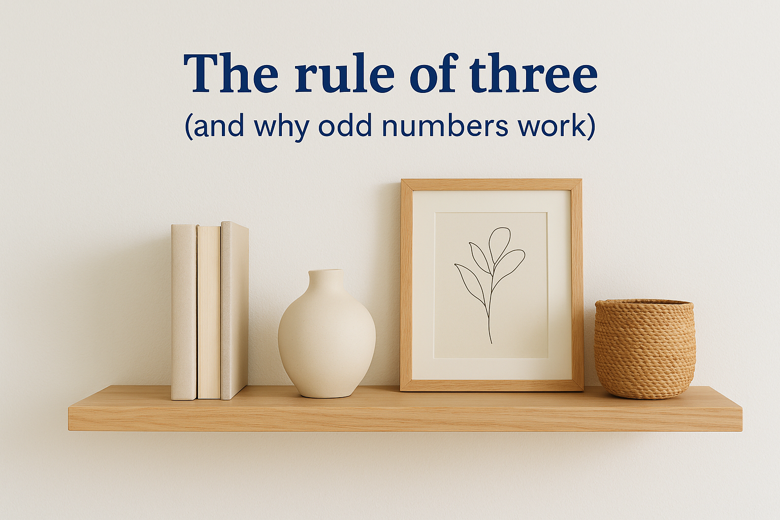
A shelf styled in odd-numbered clusters with varied heights will always read as more intentional than one lined up in matching pairs.
Height, texture, and negative space
Mixing texture and material keeps a shelf from feeling one-note. Pair a smooth ceramic vase with a woven basket, a rough stone bookend with a glossy framed photo. Contrast is what makes each object stand out instead of blending into a beige blur. Negative space matters just as much as the objects themselves. Professional stylists usually leave 30 to 40 percent of each shelf empty, which keeps the arrangement from feeling cramped and gives the eye somewhere to rest.
Surfaces and shapes should also work in conversation with each other rather than competing. Here’s a quick reference for balancing the elements that make up a strong shelf composition:
| Element | Designer approach | Amateur mistake |
|---|---|---|
| Height | Mix tall, medium, short objects | Everything the same height |
| Grouping | Odd numbers (3 or 5) | Even pairs lined up |
| Texture | Mix matte, glossy, woven, smooth | All one material |
| Negative space | 30-40% of shelf left open | Shelf packed edge to edge |
| Color | 2-3 repeated tones | Random, unrelated colors |
Common mistakes that scream store display
Overfilling is the mistake we see most often on Cape Cod installs, where clients want to show off every framed photo and souvenir at once. Resist that urge. Fewer, better objects will always outperform a crowded shelf. Placement matters too: centering everything dead-center on a shelf, or lining objects up like soldiers, is a fast way to make a beautiful piece of custom shelving look like a hotel lobby display instead of a personal home.
Styling advice only goes so far if the shelf itself isn’t built right in the first place. A shelf that sags under the weight of books, or one that’s mounted at an awkward height for the room, will fight against even the best arrangement. If you’re still in the planning phase, it’s worth thinking through spacing and depth before installation, which is exactly what we walk clients through when we build custom shelving and built-ins designed around how they actually plan to use the space, not just how it looks empty on installation day.
Step 1. Choose a theme and color palette
Before you touch a single object, decide what story your shelf is telling. A coastal reading nook looks different from a modern minimalist display, and trying to mix both on one shelf is how you end up with visual noise instead of a display. Pick one direction and let it guide every decision that follows, from the books you pull off your shelf to the vases you buy at the thrift store.
Color discipline is what separates a styled shelf from a cluttered one. Limit yourself to two or three repeated tones across the whole arrangement, then let those colors show up again and again in different objects. If your palette is cream, sage, and warm wood, that combination should appear in your book covers, your ceramics, and your frames, not just one lonely candle. Repetition is what reads as intentional to the eye, even when the objects themselves are completely unrelated.
Pick two or three colors and repeat them across every object on the shelf. That repetition is what makes a random collection of decor look like a designed set.
Matching your palette to your home’s existing style
Walk through your room before you commit to a palette. Your shelf should pull colors that already exist in your space, whether that’s the blue in a throw pillow or the black in your light fixtures. Cape Cod homes tend to lean toward these palettes, which we see over and over on the built-ins we install for clients:
- Coastal neutral: white, sand, driftwood gray, touches of navy
- Warm traditional: cream, brass, walnut, deep green
- Modern minimal: black, white, one accent color, natural wood tones
- Farmhouse: white, black iron, aged wood, soft sage
Once you’ve picked a lane, audit what you already own. You’ll usually find you have more on-theme pieces than you think, and the rest is a matter of swapping out the two or three items that clash. That’s a lot cheaper than restyling the whole shelf from scratch, and it keeps the process from turning into an all-day shopping trip you didn’t plan for.
Step 2. Sort your decor into display-ready groups
Before anything goes back on the shelf, dump everything into one pile on your kitchen table. Sorting your decor into clear categories before you start arranging saves you from the back-and-forth of grabbing random objects and testing them on the wall one at a time. This is the step most people skip, and it’s the reason they end up restyling the same shelf four times in an afternoon.
Group your objects by category first, then worry about arrangement later. Working this way turns styling into a matching exercise instead of a guessing game.
- Books: stack some flat, stand a few upright, mix spine-out with a couple turned pages-out for texture, and if the collection has outgrown the shelf, look at shelving designed around a book collection
- Vessels: vases, bowls, and jars in varying heights and shapes
- Art and mirrors: small framed pieces or a leaning mirror for depth
- Greenery: a real plant, a faux stem, or a small potted herb
- Personal objects: the one or two meaningful pieces, a shell from a Cape Cod beach trip, a small sculpture, nothing more
Sort everything into categories before you touch the shelf. Arranging becomes easy once you know exactly what you’re working with.
Edit ruthlessly before you arrange
Once your piles are sorted, cut each category down to your best two or three pieces. Editing is the part designers do that homeowners usually skip, and it’s the single biggest reason store displays look better than most living rooms. If you have six candles, keep two. If you have four picture frames, keep one and put the rest in a drawer for next season.
Anything that doesn’t fit your palette from Step 1 gets set aside, even if you love it. Sentimental value doesn’t override visual balance, though you can absolutely rotate pieces in and out every few months to keep things fresh. Ruthless editing at this stage means you’re not standing at the shelf later trying to force an object to work that was never going to fit the composition in the first place.
Step 3. Layer and arrange each shelf like a pro
Now that your objects are sorted and edited, it’s time to actually build the arrangement. Think of each shelf in layers, starting with a back layer and working toward the front edge, the same way a photographer builds a scene with foreground and background. This layering technique is what gives a flat shelf real depth, and it’s the piece most people skip when they’re arranging floating shelves for the first time.
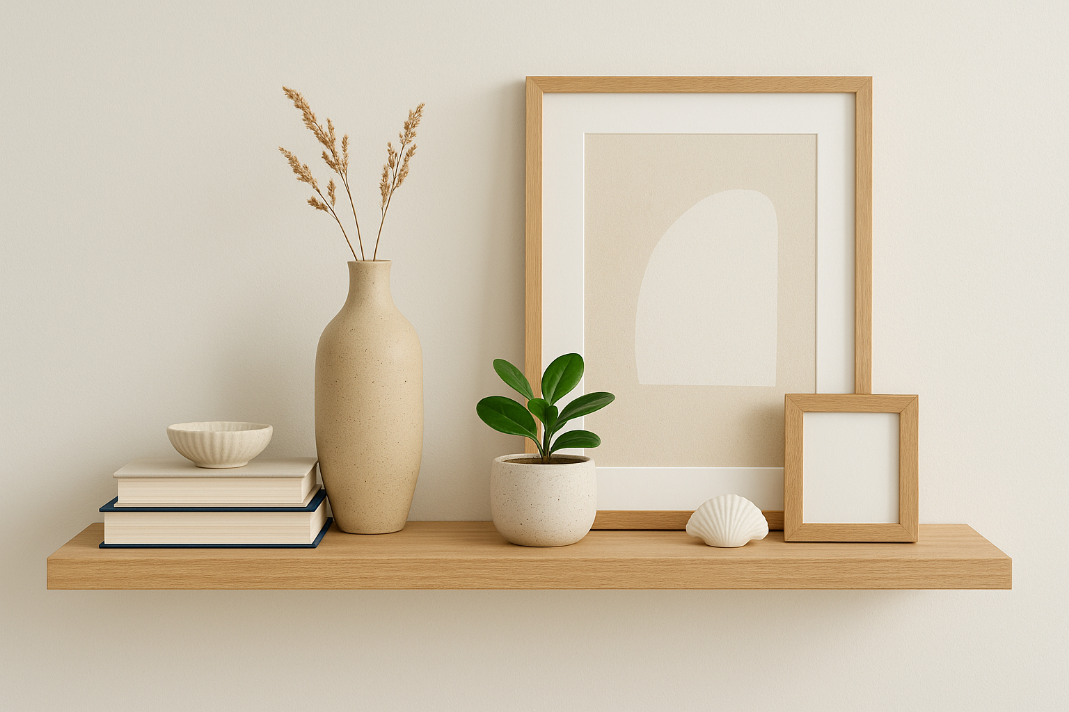
Start with your back layer
Begin with the tallest, largest pieces pushed toward the wall. A stack of books, a tall vase, or a leaning piece of framed art all work well here because they set the scale for everything else. Place your anchor object, the single largest or most visually interesting piece on the shelf, off-center rather than dead in the middle. An anchor placed roughly one-third of the way in from either edge creates a more natural focal point than one parked in the exact center.
Layer forward with smaller pieces
Once your back layer is set, add medium-height objects slightly in front and to the side of the anchor. A small vessel, a potted plant, or a stack of two books all work here. Finish with your smallest pieces tucked in front, things like a single shell, a small dish, or a tiny frame leaning against the taller item behind it. This front-to-back progression is what creates the sense of depth designers talk about, and it’s a simple trick for styling floating shelves that instantly looks more finished than a flat row of objects.
Build every shelf in layers, tall pieces at the back, small pieces up front, and you’ll get instant depth without adding a single new object.
Create a visual triangle across the shelf
Step back and check that your tallest points across the shelf form a rough triangle rather than a straight line. If everything peaks in the middle or drops flat on one side, shift a piece or two until your eye naturally zigzags across the shelf instead of sliding straight past it.
Step 4. Adapt your styling to the room it’s in
A kitchen shelf and a bedroom shelf shouldn’t be styled the same way, even if they’re built from the same board. Kitchens see grease, steam, and daily traffic, so kitchen shelving ideas for style and storage need to earn their keep with function first, decor second. Living rooms and bedrooms can lean more purely decorative since nobody’s reaching for a mixing bowl at eye level. Match your styling approach to how the room actually gets used, not just how the shelf looks in a photo.
Style function-first in kitchens and bathrooms, and purely decorative in living rooms and bedrooms. The room’s job should always shape the shelf’s job.
Kitchen and bathroom shelves
In a kitchen, mix everyday dishware with a few decorative pieces so the shelf still earns its keep, assuming the boards you chose can handle real kitchen storage weight. Stack plates you actually use, tuck in a small plant, and add one or two cookbooks for color and texture. Bathrooms follow the same logic on a smaller scale: rolled towels, a simple soap dish, and one plant that tolerates humidity, like a pothos or a small fern, keep the display practical without looking sterile, and there are plenty of bathroom shelving ideas for small spaces worth stealing.
Living room and bedroom shelves
Living rooms give you the most room to lean fully decorative. This is where layering personal touches into your shelf really pays off, since these rooms are where guests linger and actually look at what’s around them, and living room floating shelf ideas give you plenty to work from. Bedroom shelving ideas should stay calmer. Skip anything visually busy near where you sleep, and favor soft textures, muted colors, and one or two meaningful objects instead of a packed composition.
A quick room-by-room checklist
- Kitchen: function-first, everyday dishware mixed with one or two decorative pieces
- Bathroom: rolled towels, humidity-tolerant plants, minimal fragile items
- Living room: fully decorative, room to experiment with layering and personal objects
- Bedroom: calm palette, soft textures, fewer pieces, nothing visually loud
Lighting changes the calculation too. A shelf lit only by an overhead fixture will look flatter than one that catches natural light from a window or gets a small plug-in accent light. If you’re planning shelving as part of a larger renovation, it’s worth discussing placement relative to windows and fixtures before the boards ever go up, since that’s a detail that’s much harder to fix after installation than before it.
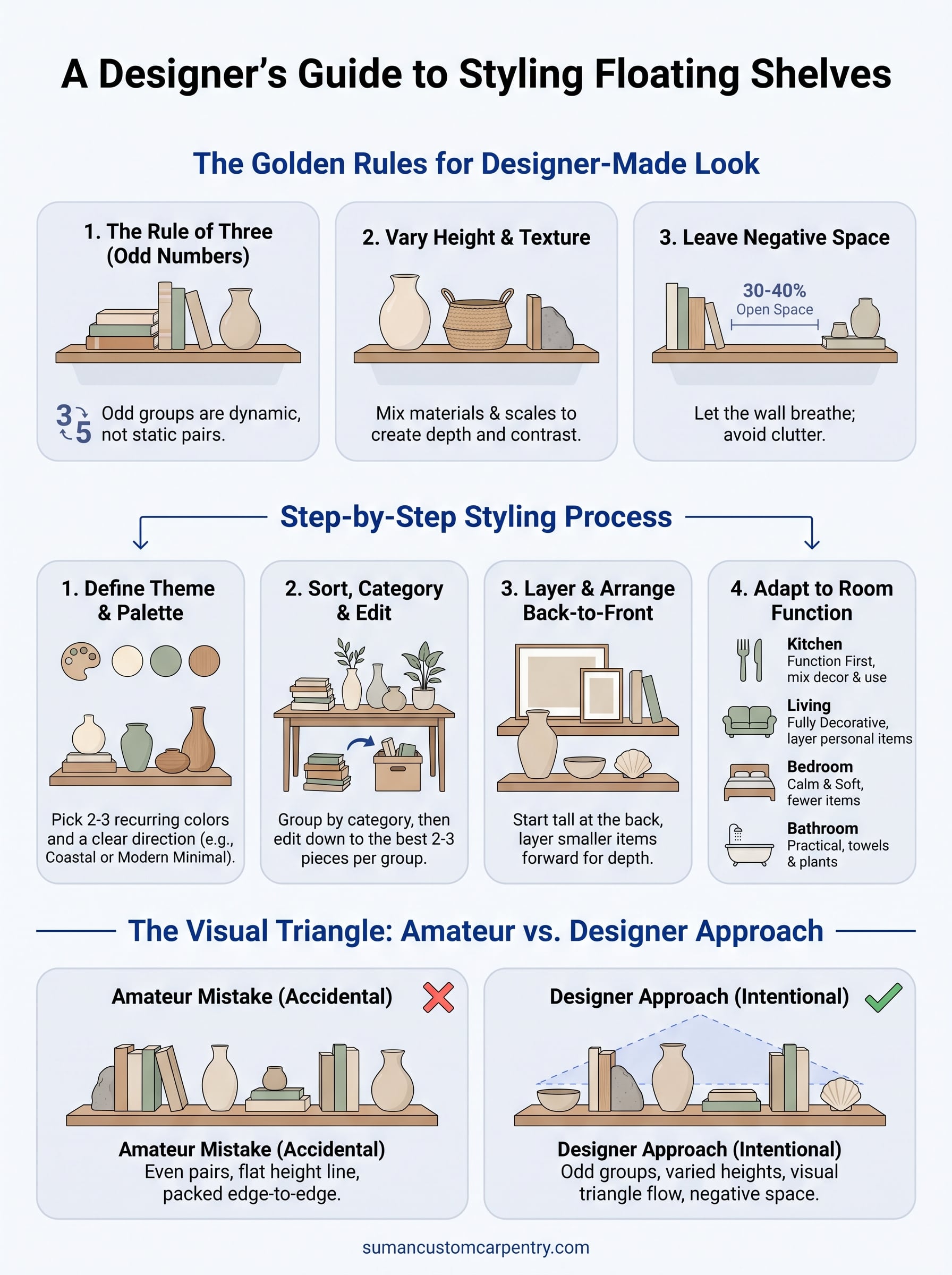
Step back and take it all in
Once every shelf is filled, walk to the other side of the room and actually look at your work from a distance. Designer shelves aren’t built up close, they’re judged from across the room, the same spot where you’ll see them every day. Check that your triangle of height still reads clearly and that no single shelf feels heavier than the others. Live with the arrangement for a few days before you second-guess it. You’ll often spot one object that needs to shift, or realize a shelf actually needed less, not more.
Great styling only goes as far as the shelf underneath it. If your boards are sagging, mounted at the wrong height, or too shallow for what you actually want to display, no amount of arranging fixes that. When you’re ready to build shelving that’s designed around your space from the start, talk to Suman Custom Carpentry about getting a custom shelving unit built for your space and how you actually live in it.