
11 Painted Kitchen Cabinet Ideas for a Cape Cod Kitchen
Staring at your kitchen cabinets and wondering if paint could fix that dated look? You’re not alone. Painted kitchen cabinet ideas are one of the fastest ways to update a Cape Cod kitchen without tearing out a single box, and the right color can make a 1990s galley kitchen feel brand new by next weekend. The trick is picking a shade and finish that actually suits coastal light and salt air, not just whatever’s trending on Pinterest this month.
This list gives you real answers: which color palettes hold up in a beach house, how two-tone cabinets create depth in small Cape kitchens, and which finishes resist humidity and daily wear better than others. We pulled these ideas from projects we’ve seen work in homes across the Cape, not generic trend roundups.
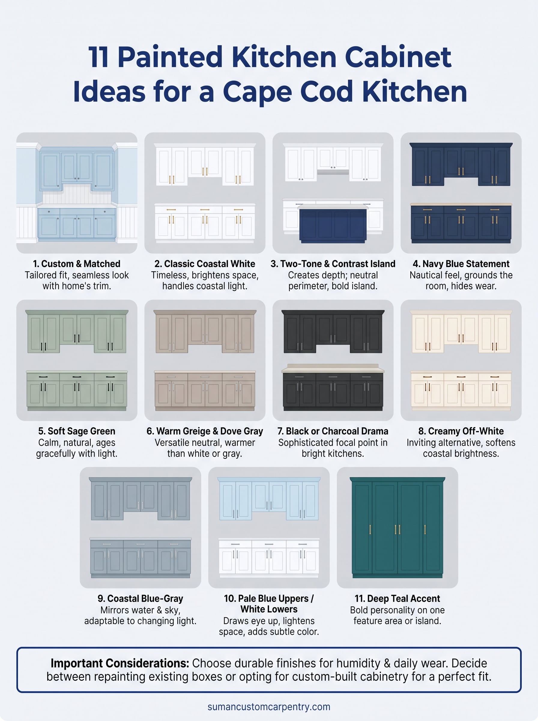
Below you’ll find 11 ideas covering everything from classic white shaker to bold navy islands, plus notes on durable paint finishes and when a full cabinet refacing makes more sense than a repaint. By the end, you’ll have a shortlist worth bringing to your next kitchen conversation.
1. Custom cabinetry painted to match your Cape Cod home
When you build cabinets from scratch instead of buying stock boxes, color stops being a compromise. Every painted kitchen cabinet idea on this list gets easier to pull off when the cabinetry itself is made to fit your kitchen’s exact dimensions, trim style, and architectural quirks, rather than forced into a leftover gap between a fridge and a wall.
The look
Custom cabinetry painted to match your home means the color, sheen, and door style are chosen specifically for your space, not picked from a limited factory palette. You get full-overlay doors, custom crown that meets your ceiling height without filler strips, and a finish sprayed on-site or in-shop to match trim you already love. The result reads intentional, like the kitchen was designed around the color rather than the color slapped onto an off-the-shelf box.
The best painted kitchen cabinets look like they were designed around the color, not colored after the fact.
Why it works on Cape Cod
Cape homes rarely have perfectly square walls or standard ceiling heights, especially in the older cottages and capes scattered from Hyannis to Chatham. Stock cabinets fight those irregularities with filler panels and awkward gaps. Custom-built cabinetry solves that at the design stage, and because we hand-build everything in our Hyannis shop, we can match a paint color to your existing trim, shiplap, or exterior shingle tone instead of asking you to compromise on a factory swatch.
How to pair it
Custom work gives you room to get specific. Some pairings we recommend when clients start from scratch:
- Match trim and cabinetry in the same white or cream for a seamless, built-in look
- Echo an exterior shutter color on an island or accent wall of cabinets for a subtle nod to the home’s shingle-style roots
- Use furniture-grade hardware, brushed nickel or unlacquered brass, to keep the custom feel consistent from box to knob
- Request a matching paint sample board before installation so you see the color under your kitchen’s actual light, morning and evening
A custom approach costs more upfront than repainting existing boxes, but it removes the guesswork of matching new paint to old cabinet construction.
2. Classic coastal white cabinets
White cabinets never really left, and on Cape Cod they’re closer to a uniform than a trend. If you want a kitchen that feels timeless the day it’s finished and still looks right in fifteen years, white cabinetry is the safest bet on this whole list.
The look
Think crisp shaker doors in a warm white like Benjamin Moore’s Simply White or a slightly cooler Chantilly Lace, paired with a satin or semi-gloss finish. Classic white cabinets brighten a kitchen instantly, bounce natural light around the room, and pair with almost any countertop, from honed marble to butcher block. The style reads clean and airy without feeling sterile, especially when paired with warm wood floors or a wood-topped island.
White cabinets are the one painted kitchen cabinet idea that never goes out of style on Cape Cod.
Why it works on Cape Cod
Older Cape homes already lean on white trim, white clapboard, and white-painted beadboard, so white cabinets extend that language into the kitchen instead of fighting it. Coastal light here tends to be strong and reflective off the water, and white finishes handle that glare better than darker tones, which can look chalky or dull under midday sun.
How to pair it
Brass or black hardware keeps white from feeling flat. Add texture with:
- A wood or butcher block island
- Woven pendant lighting
- Blue or green tile backsplash
- Brass faucet and cabinet pulls
White works well on both custom and stock cabinet boxes alike.
3. Two-tone cabinets with a contrasting island
Mixing two colors in one kitchen sounds risky until you see it done right. Two-tone cabinets let you keep perimeter cabinets neutral while the island carries a bolder color, giving the room depth without committing to one loud shade everywhere.
The look
Picture white or soft gray uppers and perimeter cabinets, then a navy, forest green, or charcoal island anchoring the center of the room. The contrast draws the eye naturally toward the island, which usually doubles as the gathering spot for morning coffee or homework. This painted kitchen cabinet idea works because it separates function visually, prep and storage stay quiet, while the island becomes the room’s focal point.
A contrasting island gives you bold color without repainting the whole kitchen.
Why it works on Cape Cod
Many Cape kitchens are open to a dining or living area, so a two-tone scheme helps define the kitchen’s footprint without walls. The lighter perimeter keeps the room feeling bright and coastal, while the darker island grounds the space and hides daily wear, scuffs, and water spots better than an all-white kitchen would.
How to pair it
Stick to one accent color for the island and repeat it somewhere else in the room:
- Island in navy, backsplash tile in a matching or complementary blue
- Island in sage, brass hardware repeated on both cabinet tones
- Island in charcoal, black plumbing fixtures throughout
Keep countertop material consistent across both tones so the kitchen still reads as one cohesive space.
4. Navy blue cabinets for a nautical statement
Few colors say Cape Cod as clearly as navy. If white cabinets are the safe choice, navy blue cabinets are the confident one, a color that leans into the coastal setting instead of just tolerating it.
The look
A full kitchen of navy shaker cabinets feels rich and grounded, especially against white countertops and a marble or subway tile backsplash. Benjamin Moore’s Hale Navy and Newburyport Blue are two shades that read as classic rather than trendy, deep enough to hide daily fingerprints but not so dark the kitchen feels closed in. Pair navy with brushed brass hardware and the whole room takes on a boat-shed elegance that photographs beautifully in any light.
Navy cabinets bring nautical style into the kitchen without a single anchor motif in sight.
Why it works on Cape Cod
Navy echoes the boats, shutters, and shingles you already see driving through Hyannis or Osterville, so it never feels out of place in a coastal home. It also holds up visually against salt air haze and shifting light better than trend colors like teal or mustard, which can look dated within a few years.
How to pair it
Balance navy’s weight with lighter surfaces elsewhere in the room:
- White or light marble countertops
- A pale beadboard backsplash
- Natural wood open shelving
- Woven or rattan light fixtures
Keep navy off every wall of a small kitchen. Reserve it for lower cabinets or one full wall, and let white ceilings and trim keep the room from feeling boxed in.
5. Soft sage green cabinets
Sage has quietly become one of the most requested painted kitchen cabinet ideas we hear from Cape Cod homeowners, and it’s easy to see why. It sits between trendy and timeless, warm enough to avoid feeling institutional but muted enough to age gracefully.
The look
Picture a soft, grayed-green shaker door, something like Farrow & Ball’s Green Smoke or Benjamin Moore’s October Mist, paired with brass or matte black hardware. Sage green cabinets read as calm rather than bold, closer to sea grass or weathered dune vegetation than a bright kelly green. The color shifts subtly with the light, looking almost gray in shadow and greener under direct sun, which keeps the kitchen feeling alive throughout the day.
Sage green cabinets bring the outdoors in without turning your kitchen into a greenhouse.
Why it works on Cape Cod
Green already surrounds Cape homes, from marsh grass to hydrangea leaves to weathered cedar shingles gone silvery green with age. A muted green palette in the kitchen extends that natural landscape indoors instead of introducing a color that competes with it. It also photographs beautifully against white trim, which most Cape homes already have in abundance.
How to pair it
Keep the surrounding materials neutral so sage stays the star:
- White or cream countertops, marble or quartz
- Unlacquered brass or oil-rubbed bronze hardware
- Woven light fixtures or a rattan pendant
- Natural wood open shelving for contrast
Avoid pairing sage with another strong color; let it breathe against quiet backgrounds.
6. Warm greige and dove gray cabinets
Gray cabinets can feel cold if you pick the wrong undertone, but a warm greige splits the difference between white and true gray without ever reading sterile. It’s one of the more forgiving painted kitchen cabinet ideas for homeowners who want a neutral that still has some personality.
The look
Greige blends warm beige with cool gray, landing somewhere neither color could reach alone. Benjamin Moore’s Revere Pewter and Edgecomb Gray are two shades that show up again and again in Cape Cod kitchens because they shift with the light, looking taupe in the morning and softer gray by evening. Dove gray cabinets paired with white trim create quiet contrast instead of a flat, matched look, and satin finishes keep the color from feeling heavy.
Warm greige gives you a neutral kitchen that still feels considered, not just safe.
Why it works on Cape Cod
Weathered cedar shingles, driftwood, and beach sand all carry the same warm-gray undertone, so greige cabinetry feels native to the coastal palette rather than borrowed from a showroom trend board. It also hides everyday smudges better than pure white, which matters in a busy family kitchen.
How to pair it
Lean into natural materials to keep the neutral from feeling flat:
- Honed soapstone or quartz countertops
- Woven or linen roman shades
- Brushed nickel hardware
- A butcher block island for contrast
Greige works equally well in custom or refaced kitchens, making it a low-risk starting point.
7. Black or charcoal cabinets for drama
Drama isn’t a word most people associate with Cape Cod, but black cabinets have earned a spot in enough renovated kitchens here that it deserves a place on this list. Used well, black or charcoal reads more sophisticated than stark, especially against the soft, sun-washed backdrop most Cape homes already have.
The look
Full charcoal or matte black shaker cabinets anchor a kitchen instantly, turning it into the room’s focal point rather than a backdrop for countertops and appliances. Charcoal cabinetry in a shade like Benjamin Moore’s Wrought Iron or Kendall Charcoal reads softer than true black, avoiding the stark, almost industrial feel that pure black can bring to a smaller room.
Charcoal cabinets add weight to a kitchen without making it feel closed in.
Why it works on Cape Cod
Black works best in kitchens with strong natural light, and many Cape homes have exactly that thanks to large windows facing the water or open backyards. The contrast between dark cabinetry and bright coastal daylight keeps the room from feeling heavy, while the color itself hides fingerprints and daily wear better than nearly any lighter finish.
How to pair it
Balance the weight of dark cabinets with lighter surfaces elsewhere:
- White or light marble countertops
- Brass or unlacquered hardware for warmth
- A butcher block island to break up the dark tone
- Plenty of white trim and ceiling space left untouched
Reserve charcoal for kitchens with generous windows or skylights.
8. Creamy off-white cabinets
White cabinets get most of the attention, but a warmer, creamier alternative solves a problem pure white sometimes creates: starkness. Creamy off-white cabinets soften the brightness of a coastal kitchen while still feeling clean and fresh, making them one of the more livable painted kitchen cabinet ideas for a busy household.
The look
Shades like Benjamin Moore’s White Dove or Swiss Coffee lean warmer than a true white, carrying just a touch of yellow or beige undertone. On shaker doors, this reads soft and inviting rather than clinical, especially in a satin finish that catches light without glaring. Off-white cabinetry pairs naturally with warm wood tones, unlike stark white, which can sometimes clash with honey-toned oak floors or a butcher block counter.
Creamy off-white gives you the brightness of white cabinets without the coldness.
Why it works on Cape Cod
Older Cape homes often have warm-toned wood floors, exposed beams, or aged trim that pure white can fight against. Warm-toned cabinetry meets those existing materials halfway, extending the home’s character instead of introducing a jarring contrast. It also hides the yellow cast that Cape Cod’s late-afternoon sun can throw across a west-facing kitchen.
How to pair it
Keep the surrounding palette equally warm so the cream doesn’t fight for attention:
- Wood open shelving in a similar warm tone
- Brushed brass or aged bronze hardware
- Cream or ivory subway tile backsplash
- Warm-veined marble or soapstone counters
This palette works well whether you’re building custom cabinetry or repainting cabinets already in place.
9. Coastal blue-gray cabinets
Somewhere between navy and sage sits a shade that captures the actual color of Cape Cod water on an overcast day. Coastal blue-gray cabinets split the difference between bold and neutral, giving you a statement color that still reads calm enough for everyday cooking.
The look
Think of a muted, grayed-out blue like Benjamin Moore’s Nimbus Gray or Farrow & Ball’s Stiffkey Blue, applied to a simple shaker door in satin finish. Unlike true navy, blue-gray cabinetry shifts with the weather outside, looking almost silver on a sunny morning and deeper blue under cloud cover. It’s one of the more versatile painted kitchen cabinet ideas because it works as a full kitchen color or limited to an island.
Blue-gray cabinets capture Cape Cod’s water and sky without committing to either one fully.
Why it works on Cape Cod
Blue-gray mirrors the actual harbor water most Cape residents see daily, so it never feels imported from a design magazine. This coastal color palette also plays well with the changeable New England light, staying flattering whether the sky outside is bright blue or fogged in.
How to pair it
Keep supporting materials light so the blue-gray stays the star:
- White quartz or marble countertops
- Brushed nickel or unlacquered brass hardware
- Light oak or whitewashed wood flooring
- A woven jute rug for texture
This shade adapts well to both custom builds and cabinet refinishing projects already in place.
10. Pale blue uppers with white lowers
Splitting the cabinet color by height instead of by zone gives you a softer version of the two-tone trick. Pale blue uppers paired with crisp white lower cabinets keep the kitchen feeling light while still adding a wash of color above eye level, right where a Cape kitchen often has the most wall space to work with.
The look
Picture upper cabinets in a barely-there blue, something like Benjamin Moore’s Palladian Blue or Sherwin-Williams’s Rainwashed, sitting above white shaker bases in a satin finish. Because the color stays pale, it reads more like a tint of sky than a bold design choice. This painted kitchen cabinet idea works especially well in kitchens with open shelving mixed among the uppers, since the blue backdrop makes dishware and glassware pop without any extra decorating.
Pale blue uppers add color where you look up, while white lowers keep the workspace bright and easy to clean.
Why it works on Cape Cod
Ceiling height and window placement vary a lot in older Cape homes, and splitting color this way draws the eye upward, making low ceilings feel taller. The pale blue also echoes hazy summer sky without overwhelming a kitchen that already gets plenty of natural light bouncing off white countertops and trim.
How to pair it
Keep hardware and countertops consistent across both cabinet heights so the split feels intentional:
- White quartz or marble countertops throughout
- Brushed nickel pulls on both upper and lower cabinets
- Open shelving mixed into the upper run
- A woven pendant light to soften the transition point
This layout suits both custom kitchens and cabinet repaints equally well.
11. Deep teal accent cabinets
Saving the boldest shade for last, deep teal accent cabinets give you a way to test a strong color without repainting an entire kitchen. Used on a single wall, pantry, or bank of cabinets, teal adds personality while letting the rest of the room stay quiet and functional.
The look
Imagine one run of cabinets, maybe a coffee bar, pantry wall, or butler’s pantry, painted in a rich teal like Benjamin Moore’s Aegean Teal or Sherwin-Williams’s Oceanside, while the main kitchen stays white or greige. This painted kitchen cabinet idea works because teal sits between blue and green, pulling from both without fully committing to either. In a satin or semi-gloss finish, it reads polished rather than trendy, especially against brass hardware.
A single wall of teal cabinets does more for a kitchen’s personality than repainting the whole room ever could.
Why it works on Cape Cod
Teal echoes the deeper harbor water you see past the shallows, giving the kitchen a coastal accent that feels specific to the region rather than borrowed from a design trend. Accent cabinetry in this shade also ages well, since it’s confined to one area and easy to update later if your taste shifts.
How to pair it
Keep the rest of the kitchen neutral so teal reads as an intentional accent:
- White or cream perimeter cabinets
- Brass or unlacquered bronze hardware
- Warm wood open shelving nearby
- A simple white or marble backsplash
This approach suits kitchens with a defined pantry or bar area more than a fully open layout.
Finding the right shade for your kitchen
Eleven ideas is plenty of inspiration, but the right choice always comes down to your own light, layout, and how long you plan to stay in the house. White and creamy off-white cabinets remain the safest long-term bet, while navy, teal, and charcoal reward homeowners ready to commit to a bolder look. If you’re still torn, start smaller: a single accent wall or island lets you test a color before painting an entire kitchen’s worth of cabinetry.
Photos and swatches only get you so far. Custom-built cabinetry painted on-site under your kitchen’s actual light will always beat guessing from a paint chip held under store fluorescents. If you’re ready to turn one of these painted kitchen cabinet ideas into a real kitchen, reach out to Suman Custom Carpentry and we’ll help you pick a shade that fits your home, not just this year’s trend.