9 Popular Kitchen Cabinet Colors for Your 2026 Remodel
Picking a cabinet color feels harder than it should. You’re staring at paint chips, scrolling design accounts, and wondering if the shade you love today will look dated in five years. That’s the real question behind popular kitchen cabinet colors: not just what’s trendy right now, but what will still hold up, both visually and practically, in a Cape Cod kitchen that sees salt air, bright coastal light, and years of daily use.
This list answers that question directly. We’re covering the specific shades and combinations homeowners are actually requesting for their 2026 remodels, from warm neutrals that pair with natural wood tones to bold statement colors on islands and lower cabinets. Each option includes what makes it work, where it looks best, and who it suits.
We build custom cabinetry by hand in our Hyannis shop, so we see these color choices play out in real homes, not just mood boards. Read through these nine options, and you’ll walk into your next design consultation with a clear direction instead of a folder of conflicting inspiration photos.
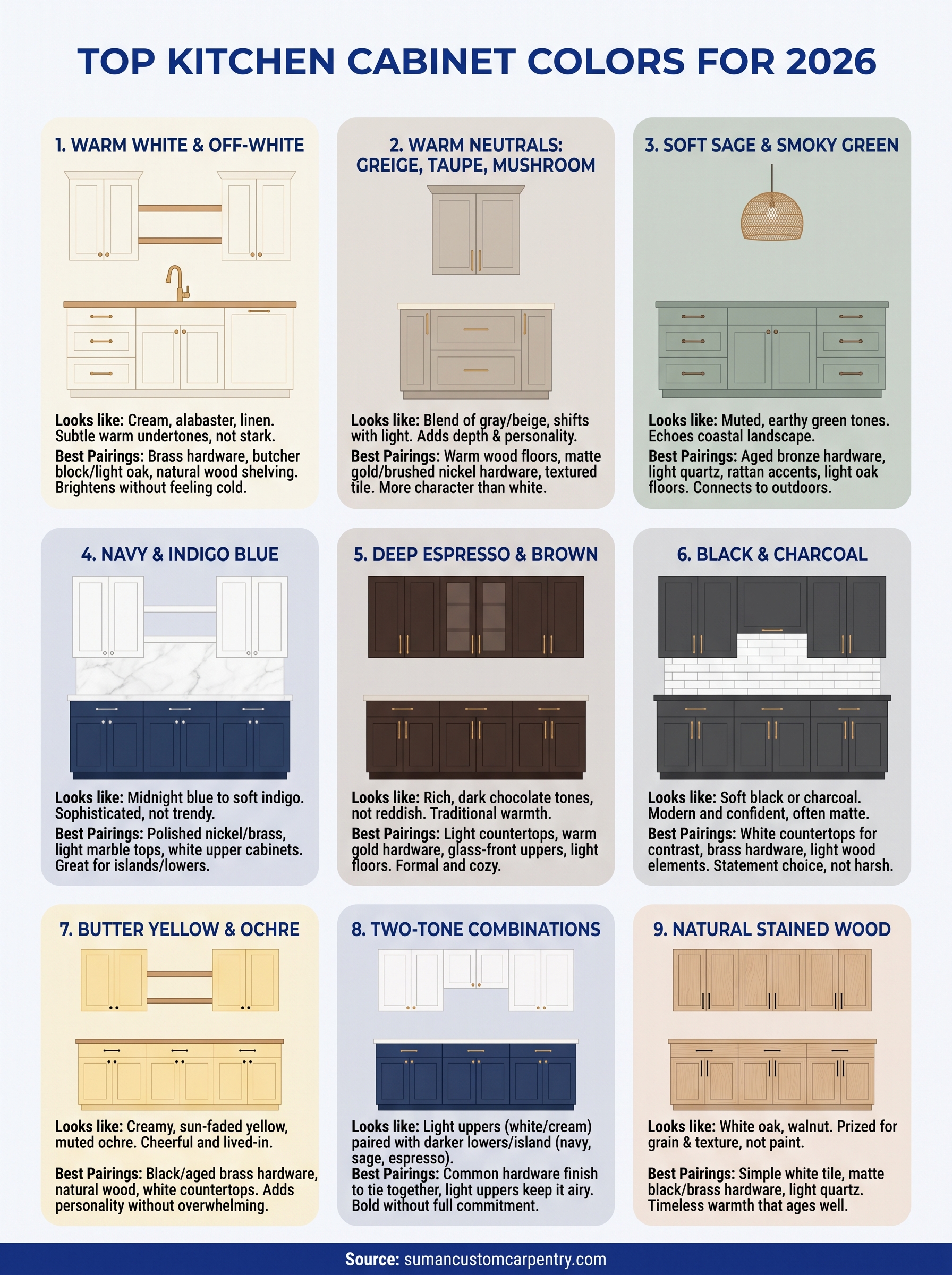
1. Warm white and off-white cabinets
Warm white has held the top spot among popular kitchen cabinet colors for nearly a decade, and it isn’t losing ground in 2026. Homeowners keep choosing it because it brightens a room without the stark, clinical feel of a true white. Cape Cod kitchens especially benefit from this shade since it bounces natural light around a space and keeps things feeling open even in older, smaller homes with limited window space.
What it looks like
Think cream, alabaster, and linen tones rather than bright white. Popular shades include Sherwin-Williams Alabaster, Benjamin Moore Simply White, and White Dove, all of which carry subtle warm undertones instead of a cool, blue-gray cast. Off-white cabinets read as soft and inviting under both daylight and warm interior bulbs, which matters a lot in older Cape homes where lighting can be inconsistent room to room.
Warm white cabinets stay popular because they brighten a kitchen without ever looking cold or sterile.
Best pairings
This shade works as a backdrop for almost any material, which is part of its lasting appeal. Consider these combinations:
- Brass or unlacquered brass hardware for warmth and a collected, timeless look
- Butcher block or light oak countertops to soften the palette further
- Black iron or matte black fixtures for contrast without harshness
- Natural wood open shelving worked into an island or accent wall
Quartz countertops with subtle veining also pair well here, since the neutral cabinet color lets the stone do the visual work instead of competing with it.
Who it’s best for
Warm white suits homeowners who want a kitchen that photographs well now and still feels current in ten years. It’s the safest resale choice if you’re planning to sell within five to seven years, since buyers rarely object to it. It also works well for smaller Cape Cod kitchens where dark cabinetry would feel heavy, and for anyone who wants flexibility to update hardware, backsplash tile, or countertops down the road without repainting the whole kitchen. If you tend to change your mind about accent colors and finishes, warm white gives you the most room to experiment around it.
2. Warm neutrals: greige, taupe, and mushroom
Greige, taupe, and mushroom tones have moved in right behind warm white as the next step for homeowners who want more depth without committing to a bold color. These shades split the difference between gray and brown, giving a kitchen more personality than plain white while still reading as neutral enough to sell a house or blend with almost any style. On Cape Cod, where so many homes lean coastal and casual, these tones add a grounded, collected feel that pure white sometimes lacks.
What it looks like
Greige cabinets carry equal parts gray and beige, while mushroom leans slightly pink-brown and taupe sits somewhere in between. Popular picks include Sherwin-Williams Agreeable Gray, Benjamin Moore Revere Pewter, and Farrow & Ball’s mushroom-toned neutrals. These warm neutral cabinets shift subtly depending on the light in the room, looking more gray in the morning and warmer by evening, which homeowners tend to appreciate rather than fight.
Greige and mushroom cabinets give you the flexibility of white with more warmth and depth.
Best pairings
These tones work especially well with:
- Warm wood floors and open shelving
- Matte gold or brushed nickel hardware
- Cream or bone-colored countertops
- Textured tile backsplash in earthy tones
Who it’s best for
This palette suits homeowners who find pure white a little sterile but aren’t ready for a saturated color commitment. It’s a strong choice for open-concept homes where the kitchen connects to a living or dining area, since greige cabinetry ties into a wider range of furniture and wall colors than stark white does.
3. Soft sage and smoky green cabinets
Green has moved from accent color to full cabinet commitment, and sage leads the pack among popular kitchen cabinet colors for 2026. It sits between gray and green, which keeps it from feeling like a bold statement while still giving a kitchen real character. On Cape Cod, this shade echoes the landscape outside, dune grass, marsh reeds, and weathered shingles, so it feels native rather than trendy.
What it looks like
Sage reads muted and dusty rather than bright or saturated. Popular picks include Sherwin-Williams Evergreen Fog, Benjamin Moore October Mist, and Farrow & Ball Card Room Green for a deeper, smoky green option. Both shift with the light, looking gray at midday and greener in evening lamplight.
Sage green cabinets bring color into a kitchen without ever shouting for attention.
Best pairings
This palette leans into natural, textural materials:
- Unlacquered brass or aged bronze hardware
- White or cream quartz countertops
- Woven pendant lighting and rattan accents
- Light oak or white oak flooring
Who it’s best for
Sage suits homeowners who want their kitchen to feel connected to the outdoors, especially in Cape Cod homes with water views or garden-facing windows. It works well for anyone tired of an all-white kitchen but wary of a darker, more dramatic color. Sage also pairs easily with existing wood tones, so it’s a smart choice if you’re keeping your flooring or trim and just updating cabinets.
4. Navy and indigo blue cabinets
Navy has become the go-to choice for homeowners who want drama without going full black, and it consistently ranks among popular kitchen cabinet colors in 2026 remodels. It reads as sophisticated rather than trendy, which explains why it keeps showing up on islands, lower cabinets, and even full kitchens along the Cape. Coastal homes especially take to this shade since it echoes deep water and evening sky, giving a kitchen a grounded, nautical feel without leaning into cliché rope-and-anchor decor.
What it looks like
Navy ranges from a true midnight blue to a softer, grayed-out indigo depending on the light. Sherwin-Williams Naval, Benjamin Moore Hale Navy, and Farrow & Ball Stiffkey Blue are the three shades homeowners request most often. Indigo cabinets with more gray mixed in feel less formal and work well against warmer wood tones.
Navy cabinets give a kitchen weight and character without the stark contrast of black.
Best pairings
This color needs contrast to keep it from feeling heavy:
- Brass or polished nickel hardware for shine
- White or light marble-look countertops
- White oak open shelving for warmth
- A white or cream upper cabinet paired with navy lowers
Who it’s best for
Navy suits homeowners who already lean toward a classic, tailored aesthetic and want their kitchen to feel like a finished room rather than just a workspace. It works especially well on islands and lower cabinetry, letting you commit to the color without overwhelming a smaller Cape Cod kitchen.
5. Deep espresso and brown cabinets
Brown cabinets are making a real comeback after years of white dominance, and espresso leads the charge among popular kitchen cabinet colors heading into 2026. This isn’t the orange-toned oak cabinetry from decades past. Today’s espresso reads richer and more refined, closer to dark chocolate than the reddish-brown finishes that fell out of favor. On Cape Cod, this shade brings a den-like warmth that suits older colonials and shingle-style homes with lower ceilings and traditional trim work.
What it looks like
Espresso sits at the darkest end of the brown family, often close enough to black that you need good light to catch its warm undertone. Sherwin-Williams Urbane Bronze and Benjamin Moore Van Deusen Blue’s brown counterpart, Wenge, are common requests, along with true espresso cabinet finishes stained rather than painted to show wood grain.
Espresso cabinets bring back the warmth of traditional wood tones without looking dated.
Best pairings
This color needs light materials to keep a kitchen from feeling closed in:
- White or cream countertops and backsplash tile
- Brushed brass or warm gold hardware
- Light wood or wide-plank flooring
- Glass-front upper cabinets to break up the mass
Who it’s best for
Espresso suits homeowners who want a traditional, formal feel rather than a bright coastal look. It works best in larger kitchens with strong natural light, where the depth of color reads as cozy instead of cramped.
6. Black and charcoal cabinets
Black cabinets have shed their intimidating reputation and become one of the more requested popular kitchen cabinet colors for 2026 remodels. Charcoal, a softer cousin of true black, gives homeowners the same dramatic effect with less risk of the kitchen feeling like a cave. Cape Cod homeowners often reach for this shade when they want a kitchen that reads as modern and confident against an otherwise traditional shingle-style exterior.
What it looks like
True black cabinets, like Sherwin-Williams Tricorn Black, deliver maximum contrast and work best with plenty of natural light. Charcoal options, such as Benjamin Moore Kendall Charcoal, soften that intensity while still reading dark from across the room. Matte black finishes have overtaken glossy black in popularity because they hide fingerprints and smudges far better in a working kitchen.
Black cabinets read as sophisticated, not harsh, once you balance them with enough light and texture.
Best pairings
Balance is everything with this color, so pair it with:
- White or light gray countertops for contrast
- Brass or matte gold hardware for warmth
- Light wood open shelving or a butcher block island
- A white tile backsplash to keep the room from feeling closed in
Who it’s best for
Black and charcoal suit homeowners who already gravitate toward modern design and want their kitchen to feel like a statement room. It works best in larger, well-lit kitchens or on an island paired with lighter perimeter cabinets, which keeps the drama contained without overwhelming a smaller Cape Cod layout.
7. Butter yellow and ochre cabinets
Yellow has quietly worked its way back into kitchen design, and butter yellow now ranks among the more surprising popular kitchen cabinet colors for 2026. It’s a departure from the neutral-heavy trends of the past few years, and homeowners tired of playing it safe are gravitating toward it. On Cape Cod, this shade nods to old beach cottages and weathered clapboard siding, giving a kitchen a cheerful, lived-in feel without tipping into novelty.
What it looks like
Butter yellow sits soft and muted rather than bright or neon. Think creamy, sun-faded tones rather than a bold primary color. Popular picks include Sherwin-Williams Butter Up and Benjamin Moore Hawthorne Yellow, both of which lean warm rather than acidic. Ochre cabinet finishes go a shade deeper and more earthy, closer to mustard than lemon, and tend to show up on islands more often than full kitchens.
Butter yellow cabinets bring warmth into a kitchen that feels collected, not costume-like.
Best pairings
This color needs a calm backdrop to keep it from feeling overwhelming:
- White or cream countertops and backsplash tile
- Black or aged brass hardware for grounding
- Natural wood floors and open shelving
- White upper cabinets paired with a yellow island
Who it’s best for
Butter yellow suits homeowners who want personality in their kitchen and aren’t chasing resale-neutral choices. It works particularly well in cottage-style Cape homes with plenty of natural light, where the color reads as warm rather than garish. It’s also a smart choice for an island or a secondary color rather than the whole kitchen if you want the effect without full commitment.
8. Two-tone cabinet combinations
Two-tone kitchens have moved from a niche design choice to one of the more requested popular kitchen cabinet colors setups heading into 2026. Instead of picking one shade for every cabinet, homeowners are splitting the palette between uppers and lowers, or between the island and the perimeter. It gives you the visual interest of a bold color without committing your entire kitchen to it, which explains why it’s become such a common request in our Hyannis shop.
What it looks like
The most common formula pairs a light upper cabinet, usually white or off-white, with a darker or more saturated lower cabinet in navy, sage, or espresso. Some homeowners flip the formula on an island instead, keeping the perimeter neutral and letting the island cabinet color carry all the personality. Either way, the goal is contrast without clutter.
A two-tone kitchen lets you commit to a bold color without living inside it all day.
Best pairings
The strongest two-tone combinations share a common thread, whether that’s undertone, material, or hardware finish:
- White uppers with navy or black lowers
- Warm white uppers with sage or olive lowers
- Cream uppers with espresso island
- Matching hardware finish across both tones to tie the look together
Who it’s best for
Two-tone works well for homeowners who like a bold color but worry about long-term commitment or resale value. It also suits open-concept Cape Cod kitchens, where a lighter perimeter keeps the room feeling airy while a darker island grounds the space.
9. Natural stained wood cabinets
After years of paint dominating the cabinet conversation, natural wood is pulling homeowners back toward grain and texture instead of solid color. It’s one of the more grounded popular kitchen cabinet colors for 2026 because it never really left, it just waited for painted trends to cycle through. Cape Cod homes with exposed beams or original woodwork take to this look especially well, since stained cabinets echo what’s already built into the house.
What it looks like
White oak leads the pack, prized for its straight, subtle grain and light honey tone that reads modern rather than rustic. Walnut offers a richer, darker alternative for homeowners who want more contrast against white walls. Stained wood cabinets let the material speak instead of hiding behind paint, which means every door shows slightly different grain patterns.
Natural wood cabinets bring warmth into a kitchen that no paint color can fully replicate.
Best pairings
Keep the surrounding palette simple so the wood grain stays the focus:
- White or light quartz countertops for contrast
- Matte black or brass hardware
- Simple white subway tile backsplash
- Minimal upper cabinets or open shelving
Who it’s best for
Natural stain suits homeowners who want warmth without choosing a color at all, and who plan to stay in their home long enough to enjoy grain that only looks better with age.
Finding the right color for your renovation
Nine options, one decision that ultimately comes down to your home, your light, and how long you plan to live with the result. Warm neutrals and sage offer the safest long-term bet if you want a kitchen that ages well, while navy, black, and butter yellow reward homeowners ready to commit to a stronger identity. Two-tone setups and natural wood split the difference, giving you personality without asking you to choose just one direction.
Whatever shade pulls you in, the color only works if the cabinetry behind it is built right. Paint and stain can’t hide poor joinery or hardware that loosens after a year of daily use, and that’s where a hand-built approach makes the real difference on Cape Cod. If you’re ready to turn a paint chip into a finished kitchen, reach out to Suman Custom Carpentry and let’s talk through what fits your home.