
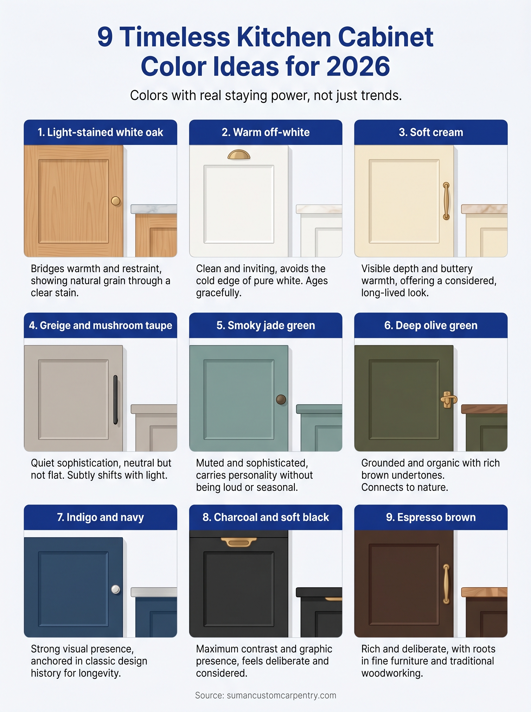
Picking a cabinet color sounds simple until you’re staring at forty paint swatches under your kitchen lights at 9 PM. The wrong choice can make a $30,000 renovation feel dated within a few years. The right one? It carries the whole room for decades. If you’ve been searching for kitchen cabinet color ideas that won’t feel like a trend you’ll regret, you’re in the right place. These are colors with real staying power, not just what’s popular on social media this month.
At Suman Custom Carpentry, we design and hand-build custom kitchen cabinets at our shop in Hyannis, Cape Cod. Color selection is one of the first conversations we have with every client, and after seven-plus years of building kitchens across the Cape, we’ve watched certain colors hold up beautifully while others fade from favor fast. That hands-on experience shapes every recommendation in this list.
Below, you’ll find nine cabinet colors that feel fresh right now and won’t box you into a trend cycle. For each one, we’ll cover what makes it work, which kitchen styles it pairs with, and specific paint options worth considering. Whether you’re planning a full kitchen renovation or just refreshing your existing cabinetry, these picks will help you choose with confidence.
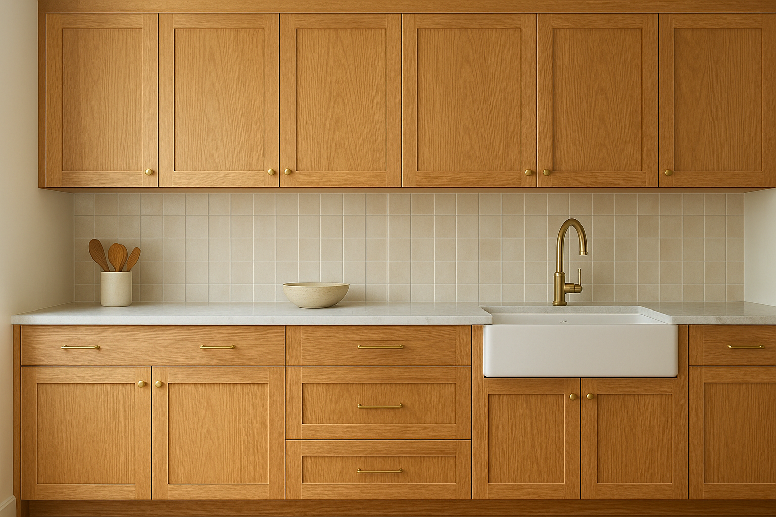
1. Light-stained white oak
Light-stained white oak is not a painted finish. It’s a natural wood tone that shows the grain through a clear or very lightly pigmented stain. This option sits near the top of any strong list of kitchen cabinet color ideas because it bridges warmth and restraint in a way that painted finishes rarely do. Few choices carry this level of versatility across kitchen styles and design directions.
Why this reads timeless in 2026
Natural wood has never truly gone out of style; it just cycles in and out of dominance. White oak in particular has a tight, straight grain and a warm golden-beige tone that reads contemporary without chasing trends. In 2026, the shift away from stark all-white kitchens is well underway, and white oak fills that gap without swinging into heavy or dark territory.
Unlike paint colors that can feel product-specific or era-stamped, a well-applied natural stain reads more like a material choice than a trend decision. That distinction is what gives it longevity.
White oak develops a natural patina over years that deepens its character rather than making it look dated or worn.
Best pairings for counters, backsplash, and floors
The right surrounding materials anchor the oak tone rather than compete with it. Honed quartzite or leathered granite in creams and warm whites keeps the palette cohesive. For backsplash, handmade ceramic tile in soft white or warm sand adds depth without pulling focus from the grain. Avoid cool-toned quartz with blue or gray veining, as it will fight the warmth of the oak.
- Counters: honed quartzite, butcher block, warm white quartz
- Backsplash: handmade ceramic, zellige, or textured subway tile in cream
- Floors: white oak hardwood, terracotta, or light limestone
Hardware and fixture finishes that look right
Unlacquered brass and aged bronze are the natural partners for white oak cabinets. Both finishes pick up the warm undertones in the grain without looking forced. Matte black hardware also works if you want sharper contrast, though it shifts the overall feel toward modern. Polished chrome and brushed nickel read too cool against oak’s warmth, so your best bet is to stay in the warm metal family.
Cape Cod-friendly design notes
On Cape Cod, natural light quality and coastal humidity both factor into how cabinet finishes perform and look over time. White oak handles moisture well when properly sealed, making it a practical choice for kitchens near the water. The warm, natural tone complements the sandy, sun-bleached palette that feels native to Cape Cod interiors, pairing especially well with wide-plank floors and natural linen tones common across the region.
2. Warm off-white
Warm off-white sits between a true white and a light cream. It has enough color to feel intentional without dominating the room. This is one of the most dependable kitchen cabinet color ideas for homeowners who want brightness without the cold edge that pure white often brings.
Why this reads timeless in 2026
The shift away from cool, blue-toned whites has been building for years. Warm off-whites like Benjamin Moore’s White Dove (OC-17) or Sherwin-Williams’ Alabaster (SW 7008) carry strong staying power because they read clean and inviting without feeling clinical. They work across traditional, transitional, and modern kitchens without anchoring you to a specific decade.
Warm whites with yellow or soft gray undertones age far more gracefully than stark cool whites under shifting natural light.
Best pairings for counters, backsplash, and floors
Pair warm off-white cabinets with marble or quartz that carries warm veining in ivory, taupe, or soft gold. A classic subway tile with a warm grout in linen or cream keeps the backsplash cohesive. Medium-toned wood floors or light stone both ground the palette without pulling it cold.
Hardware and fixture finishes that look right
Brushed gold and satin brass are the strongest matches here. Both finishes add warmth and visual weight without overpowering the softness of the cabinet color. Matte black works as a contrasting option if you want more definition throughout the space.
Cape Cod-friendly design notes
Warm off-white reflects natural coastal light well and pairs easily with the weathered wood, rope textures, and linen tones common in Cape Cod interiors. It also photographs well in bright, open kitchens, which matters if you ever plan to list the property.
3. Soft cream
Soft cream sits a step warmer and richer than off-white. It carries visible depth and a buttery warmth that gives cabinetry a finished, considered look without relying on bold color. Among kitchen cabinet color ideas that appeal to homeowners wanting something inviting and long-lived, soft cream delivers consistently across kitchen sizes and natural light levels.
Why this reads timeless in 2026
This tone carries associations with high-end European kitchens and traditional American farmhouses alike. That cross-style appeal is what keeps it relevant year after year. Colors like Benjamin Moore’s Pale Straw (2154-50) or Farrow and Ball’s Cream (No. 40) offer just enough saturation to feel intentional without tipping into yellow territory.
Cream tones tend to warm up under incandescent lighting, which makes them feel especially comfortable in kitchens you use heavily in the evenings.
Best pairings for counters, backsplash, and floors
Cream cabinets pair well with warm-veined marble or ivory quartz countertops. For the backsplash, handmade ceramic tile in white or sand keeps your palette grounded. Medium oak or walnut floors add contrast without tension.
- Counters: ivory quartz, honed marble, warm white granite
- Backsplash: handmade ceramic, sand-toned zellige, or linen-toned subway tile
- Floors: medium oak, wide-plank pine, or light limestone
Hardware and fixture finishes that look right
Unlacquered brass and brushed nickel both complement cream well, though brass adds more warmth to your overall palette. Polished chrome reads too cool against cream’s softness, so it’s worth avoiding.
Cape Cod-friendly design notes
On Cape Cod, cream cabinets reflect warm afternoon light beautifully. The tone connects naturally to weathered shingles and sandy dune tones that define the regional aesthetic, making it one of the most cohesive choices for coastal homes in the area.
4. Greige and mushroom taupe
Greige sits in the space between gray and beige, while mushroom taupe leans slightly warmer with a soft brown-gray quality. Both tones offer quiet sophistication without committing to a strong color statement, which is exactly why they hold up so well over time. For homeowners exploring kitchen cabinet color ideas that read neutral without feeling flat, this family of tones consistently delivers.
Why this reads timeless in 2026
Greige and taupe work because they absorb and reflect the surrounding palette without clashing with changing decor. Colors like Benjamin Moore’s Pale Oak (OC-20) or Sherwin-Williams’ Accessible Beige (SW 7036) carry just enough warmth to feel grounded while remaining flexible across lighting conditions.
Neutral-warm tones like greige tend to look better in person than on a paint chip, since they shift subtly with natural and artificial light throughout the day.
Best pairings for counters, backsplash, and floors
Greige cabinets pair naturally with warm white quartz or veined marble countertops. For the backsplash, a textured ceramic or linen-toned tile keeps the visual layering intentional without adding busy contrast. Medium or dark hardwood floors anchor the space with enough depth to prevent the overall palette from reading washed out.
Hardware and fixture finishes that look right
Brushed brass and matte black are both strong choices here. Brushed brass adds warmth, while matte black sharpens the contrast and gives the cabinets a more defined presence.
Cape Cod-friendly design notes
Greige and taupe connect naturally to Cape Cod’s sand, stone, and driftwood tones. These colors complement natural shingle exteriors and make transitions between interior and exterior spaces feel cohesive in open-plan coastal homes.
5. Smoky jade green
Smoky jade green is a muted, blue-green tone that reads more sophisticated than a typical sage or mint. It carries just enough gray to keep the saturation in check, which is what separates it from colors that feel seasonal or loud. As a kitchen cabinet color idea, smoky jade delivers real personality without sacrificing longevity.
Why this reads timeless in 2026
Green has re-emerged as one of the strongest non-neutral options for cabinetry, and the smoky, muted end of the spectrum is where the staying power lives. Colors like Farrow and Ball’s Mizzle (No. 266) or Benjamin Moore’s Aegean Teal (2136-40) sit in this range, offering depth without aggression. The gray undertone prevents the color from feeling era-specific within a few years.
Muted greens with gray undertones hold up far better over time than bright or saturated greens, which tend to feel trend-specific within a decade.
Best pairings for counters, backsplash, and floors
Pair smoky jade with warm white quartz or soft marble to balance the coolness in the green. A cream or off-white backsplash tile lets the cabinets lead without creating visual tension. Medium wood floors add warmth that keeps the overall palette from reading too cool.
- Counters: warm white quartz, honed marble, or ivory granite
- Backsplash: cream ceramic, handmade tile, or linen-toned zellige
- Floors: medium oak, walnut, or warm-toned stone
Hardware and fixture finishes that look right
Brushed brass and unlacquered brass are the strongest hardware choices for smoky jade, since the warm metal tone creates direct contrast against the blue-green base. Matte black works well if you want a sharper, more graphic result throughout the space.
Cape Cod-friendly design notes
On Cape Cod, smoky jade connects naturally to sea glass, ocean water, and weathered copper tones that feel native to the region. This color is a strong fit for coastal kitchens that want clear character without stepping away from the surrounding natural palette entirely.
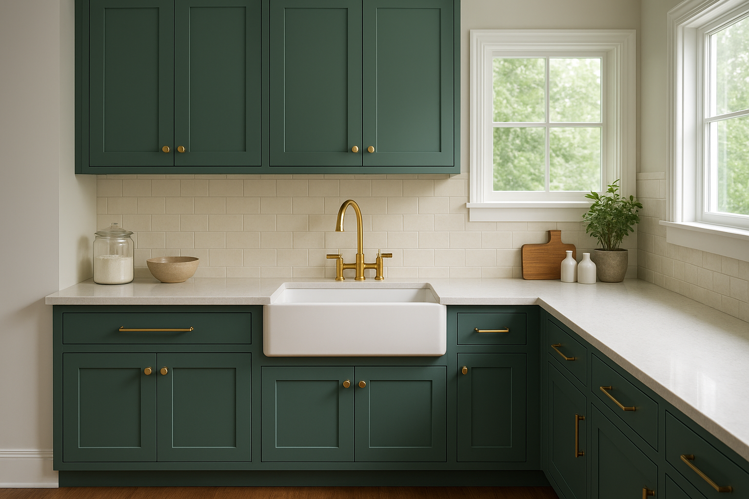
6. Deep olive green
Deep olive green sits in darker, earthier territory than smoky jade. It carries rich brown undertones that give it a grounded, organic quality most other cabinet colors can’t match. If you’re looking for kitchen cabinet color ideas with real depth and character, this tone delivers both without requiring bold contrast elsewhere in the room.
Why this reads timeless in 2026
Deep olive pulls from natural landscapes rather than interior trend cycles, which is a large part of why it holds up. Colors like Farrow and Ball’s Chives (No. 80) or Benjamin Moore’s Dried Thyme (HC-180) sit in this range. The brown base keeps them from reading as fashion-forward greens that age quickly.
Olive tones with brown undertones tend to look richer under warm incandescent lighting than they do on a paint chip.
Best pairings for counters, backsplash, and floors
Pair deep olive with warm white or cream countertops to prevent the overall palette from going too dark. A simple cream or off-white backsplash tile lets the cabinet color carry the room’s personality. Light to medium wood floors add warmth without adding visual weight.
Hardware and fixture finishes that look right
Unlacquered brass and aged bronze are the strongest choices against deep olive. Both warm metals complement the brown undertones in the green. Matte black works as a sharper alternative if you want more graphic contrast throughout your space.
Cape Cod-friendly design notes
Deep olive connects to coastal marshland, pine forests, and weathered copper tones that are native to Cape Cod’s landscape. It’s a strong fit for homes surrounded by natural vegetation, where the cabinet color echoes what’s visible through the windows.
7. Indigo and navy
Indigo and navy bring deep, rich color into the kitchen without the darkness that charcoal or black creates. These blue tones carry strong visual presence while staying grounded enough to feel purposeful rather than trendy. For homeowners exploring kitchen cabinet color ideas that make a clear statement, navy and indigo offer real character with genuine staying power.
Why this reads timeless in 2026
Navy has anchored classic American and British interiors for well over a century, which puts it in a different category from colors that rise and fall with short trend cycles. Colors like Benjamin Moore’s Hale Navy (HC-154) or Sherwin-Williams’ Naval (SW 6244) carry enough depth to feel considered without veering into territory that dates quickly.
Deep blue tones perform particularly well in kitchens with ample natural light, where the color shifts from rich to almost luminous throughout the day.
Best pairings for counters, backsplash, and floors
Navy cabinets work best against bright white or warm white countertops that give the eye a place to rest. A simple white ceramic or marble-look backsplash keeps the palette from feeling heavy. Light to medium wood floors add warmth that balances the cool intensity of the blue.
Hardware and fixture finishes that look right
Brushed brass and polished nickel are both strong choices against navy. Brass adds warmth and contrast, while polished nickel keeps the palette crisp and clean.
Cape Cod-friendly design notes
Navy connects directly to Cape Cod’s maritime identity, from lobster boats to painted shutters throughout historic Hyannis. This color feels genuinely native to the region rather than imported from a trend board.
8. Charcoal and soft black
Charcoal and soft black bring maximum contrast and graphic presence to a kitchen without the heaviness that a true flat black can carry. These are bold kitchen cabinet color ideas for homeowners who want a dramatic, deliberate result and are comfortable committing to strong color throughout the space.
Why this reads timeless in 2026
Dark cabinetry has roots in traditional lacquered furniture and high-end commercial design, which gives it a longer cultural history than most paint trends. Colors like Benjamin Moore’s Black Panther (2125-10) or Sherwin-Williams’ Tricorn Black (SW 6258) offer the depth of black with just enough softness to avoid reading harsh under kitchen lighting. The result is a finish that feels considered rather than reactive.
Charcoal and soft black cabinets tend to recede visually, which makes the room feel larger and lets your countertops and backsplash carry the eye.
Best pairings for counters, backsplash, and floors
Pair dark cabinets with bright white or warm white countertops for clear contrast. A light marble or white ceramic backsplash gives the eye relief, and light wood or white oak floors keep the space from feeling closed in.
- Counters: bright white quartz, honed marble, or warm white granite
- Backsplash: white ceramic, classic subway tile, or light marble
- Floors: white oak, light-stained hardwood, or pale limestone
Hardware and fixture finishes that look right
Brushed brass and unlacquered brass are the strongest choices against charcoal, since the warm metal creates direct visual contrast against the dark base. Polished chrome also works well if you want a sharper, cleaner result throughout the space.
Cape Cod-friendly design notes
Charcoal cabinets pair well with white shiplap, bright trim, and natural wood accents common in Cape Cod interiors. The contrast reads sharp and deliberate in kitchens with strong natural light, which is a defining feature in the region’s open-plan coastal homes.
9. Espresso brown
Espresso brown is a deep, warm-toned brown that reads rich and deliberate without the visual weight of black cabinetry. It sits in a category of kitchen cabinet color ideas that age well precisely because the color connects to natural materials rather than paint trend cycles.
Why this reads timeless in 2026
Espresso brown has roots in fine furniture and traditional woodworking, which gives it cultural staying power that most paint-forward colors lack. A deep brown tone like Benjamin Moore’s Espresso (2114-10) or Sherwin-Williams’ Kona Brown (SW 6073) carries just enough richness to feel considered without veering into territory that feels era-specific within a few years.
Brown tones with warm red or orange undertones tend to deepen under incandescent kitchen lighting, adding visual richness that paint chips can’t fully represent.
Best pairings for counters, backsplash, and floors
Pair espresso cabinets with cream or warm white countertops to keep the palette from going too dark. A light ceramic or stone-look backsplash in off-white or warm sand gives the eye relief and prevents the space from closing in.
- Counters: warm white quartz, honed marble, or ivory granite
- Backsplash: off-white ceramic, linen-toned tile, or classic subway in cream
- Floors: white oak, light-stained hardwood, or pale limestone
Hardware and fixture finishes that look right
Brushed brass and unlacquered brass are the strongest choices against espresso brown, since warm metals pick up the red undertones in this color naturally. Polished chrome works as a cooler alternative if you want sharper contrast throughout your kitchen.
Cape Cod-friendly design notes
Espresso brown pairs well with natural linen textiles, white trim, and light oak floors common in Cape Cod interiors. Your kitchen benefits most from this color in rooms with strong natural light, where the tone reads rich and warm rather than heavy.
A simple way to decide
Every strong list of kitchen cabinet color ideas points back to the same core question: what do you want the room to feel like in ten years, not just right now? Start there. If you want warmth and texture, white oak or espresso brown gives you both. If you want something quiet and adaptable, warm off-white or greige carries nearly any kitchen through design changes over time. If you want clear personality, smoky jade, navy, or charcoal delivers that without boxing you into a short trend cycle.
Your cabinets are the largest surface in your kitchen, so the color decision deserves more than a quick pick from a paint chip. If you’re planning a custom kitchen on Cape Cod and want to talk through your options with someone who builds these spaces by hand, reach out to Suman Custom Carpentry to start the conversation.